UK-based Graphic Designer
Beautiful Beers is an independent beer shop in my hometown, known for its carefully curated selection of quality beers. This self-initiated project reimagines the shop’s visual identity to better reflect the expertise, trust, and standards behind its offering.

A Mark of Excellence
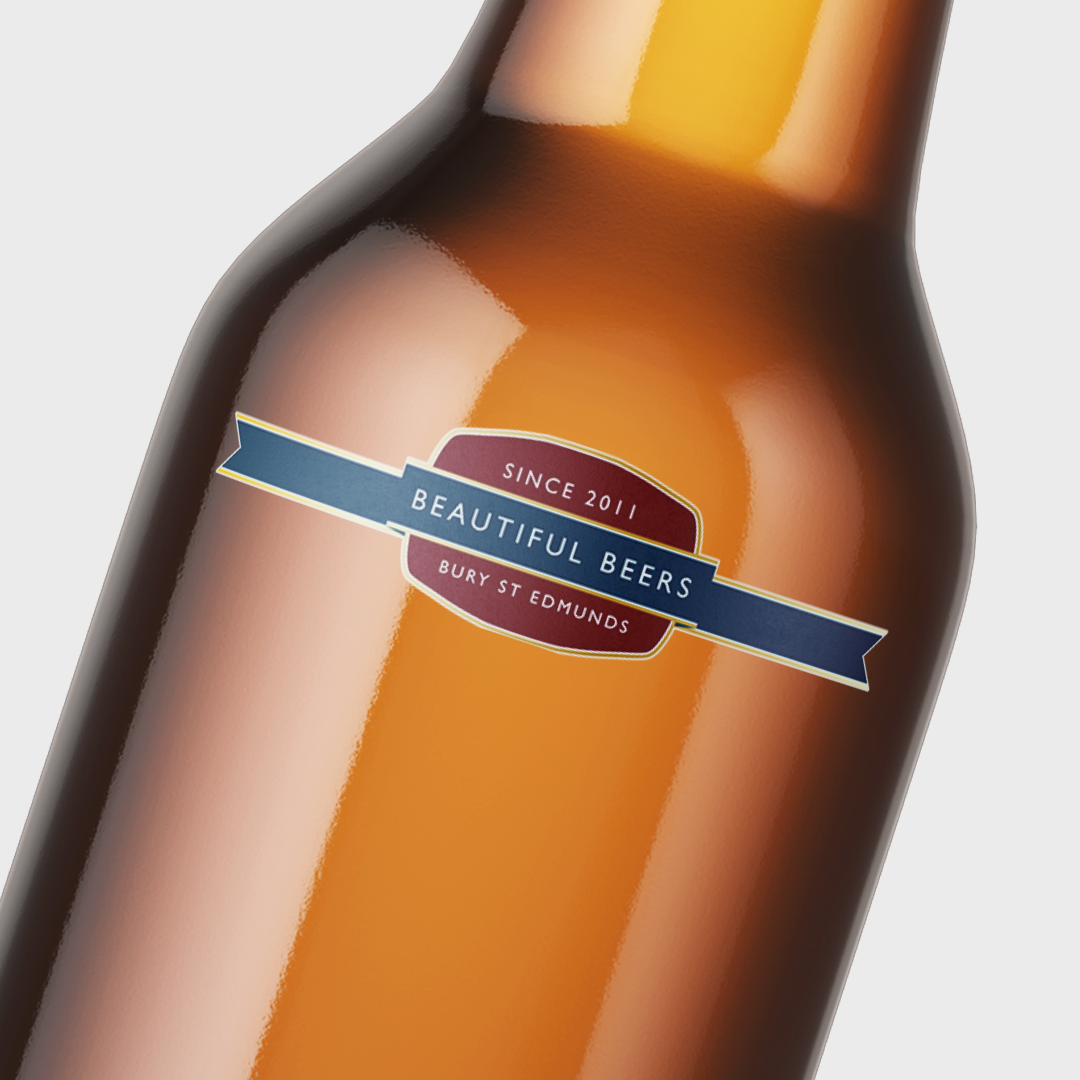
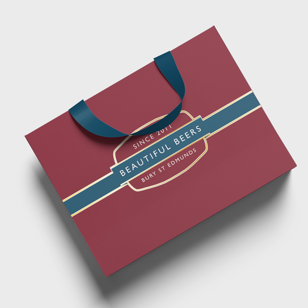
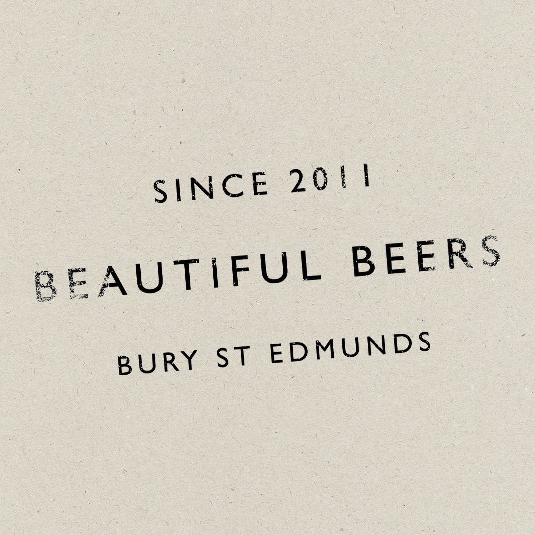
The identity is centred around a logo that functions as a mark of excellence rather than a decorative symbol.
Applied across the shop and its products, the mark acts as a stamp of approval — helping customers quickly identify beers selected for their quality, while positioning the shop as a knowledgeable and trusted curator within craft beer culture.
Identity System
The logo is designed to work across multiple roles:
- as the primary identity for the shop
- as a secondary endorsement mark applied directly to products
Its restrained typography and considered form ensure it remains legible, recognisable, and credible at both large and small scales, allowing it to integrate naturally into a real retail environment.
In Use
The identity system is designed for practical, everyday use within the shop, including:
- shopfront and window signage
- shelf labels and price markers
- bottle and can endorsements
Used consistently, the mark reinforces quality and trust, helping the shop stand out through clarity rather than excess.